Crypto checkout audit

Interview design challenge
From brief to discussible concepts in 8 hours

A crypto payments company asked me to critique their checkout experience as part of an interview process. I had one day to analyse the existing flow, benchmark against industry checkout patterns, identify pain points, and present initial solutions. This is how I approach rapid diagnosis: research-led, focused on real problems, and always aiming for something we can discuss and build on rather than pixel-perfect deliverables.

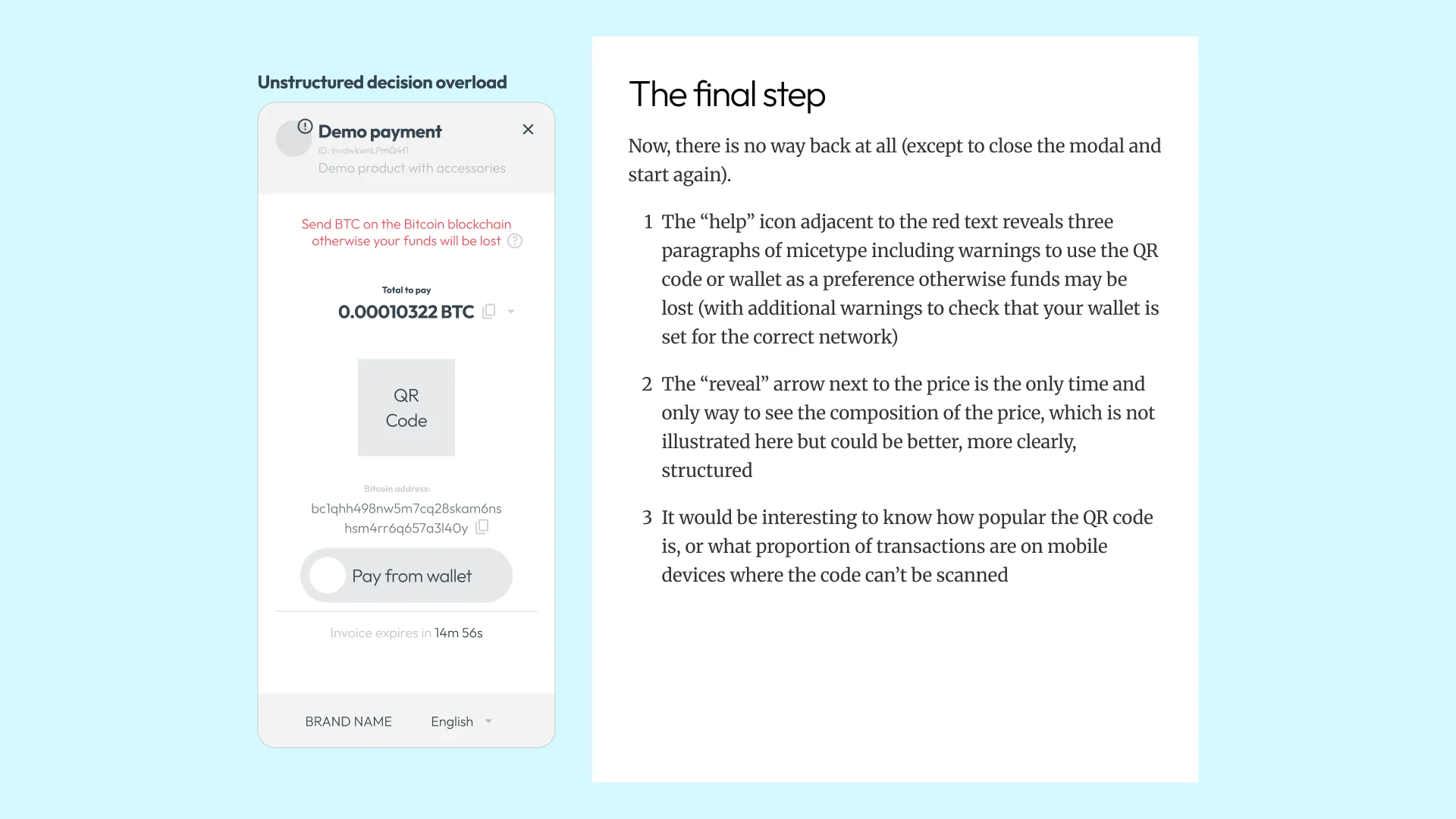
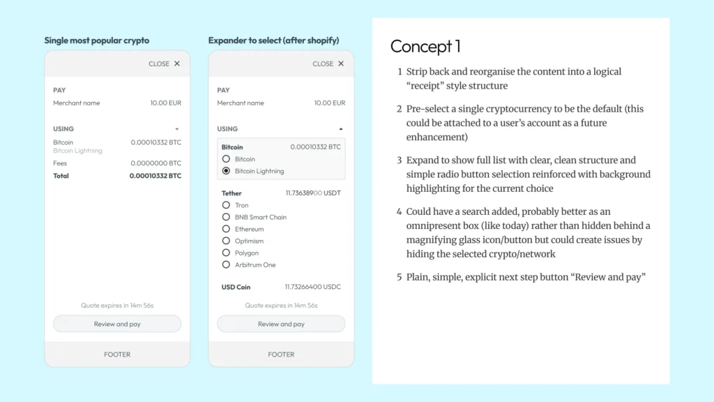
Understanding the landscape

Before sketching anything, I needed to understand what “good” looks like in this space. Crypto checkouts sit in an odd position – they need the trust cues of traditional payment flows but handle unfamiliar concepts like wallet selection and network fees. I spent roughly half my time on research: benchmarking industry patterns, reviewing Baymard’s checkout guidelines, and documenting the existing experience.

This wasn’t procrastination – it was building the foundation for defensible recommendations.

1

Positioning against the visual language of fintech leaders

The company’s marketing borrows visual language from Stripe and Modulr – the gradient blobs, the floating UI mockups. That’s fine for the homepage, but it sets expectations. If your brand says “we’re as polished as Stripe,” your checkout needs to deliver. I documented this not as criticism but as context: the benchmark they’ve implicitly set for themselves.

2

The checkout patterns users already expect

Most online purchases flow through Shopify or Stripe – which means users arrive with ingrained expectations about how checkouts work. The persistent order summary, the predictable step sequence, the restrained merchant branding.

I documented these not as competitors but as conventions. Any crypto checkout that ignores them is fighting learned behaviour as well as solving its own problems.

3

Baymard's research as a diagnostic lens

The Baymard Institute has tested checkout UX more rigorously than anyone.

I pulled relevant findings – field labelling, validation patterns, form layout – and used them as a checklist against the current implementation. This isn’t about slavishly following guidelines; it’s about knowing which battles are already won so I can focus on the crypto-specific problems.

4

The obvious problem: it doesn't work on mobile

The demo checkout loads as a popover that doesn’t resize properly on mobile devices. Content gets clipped, touch targets overlap, the experience breaks. This isn’t a UX subtlety – it’s a bug. I documented it because sometimes the most important finding is the simplest one.

Shaping the solution

With the research done, I had about four hours left to analyse the actual user journey, identify the key pain points, and develop initial concepts. The goal wasn’t a polished prototype – it was something we could discuss in a 60-minute session. Wireframes as conversation starters, not deliverables. This is where the morning’s benchmarking pays off: every recommendation could be grounded in evidence, not opinion.

1

Mapping the journey and marking the friction

I walked through the checkout flow repeatedly, annotating where I hesitated, where information was missing, and where the interaction model felt unfamiliar. The orange annotations in this walkthrough mark moments I wanted to discuss: Why does the popover exist? What happens if I select the wrong coin? Why is there a QR code when I’m already on my phone?

2

Questions before wireframes

I captured open questions alongside the wireframe concepts – things I couldn’t answer from the demo alone. How savvy are the users? Is this an invoice, an offer, or a quote? Can we ditch the popover entirely? These aren’t gaps in my analysis; they’re the right questions to bring to a design discussion. Assumptions need to be surfaced, not buried.

3

Two concepts, same constraint

Both initial concepts worked within the existing popover model – the goal was improvement, not revolution. Concept 1 stripped the UI back to a receipt-style structure with a sensible default and expandable options. Concept 2 showed everything upfront with search and filtering. Different trade-offs, same foundation. The point was giving the team concrete options to react to, not a single “right answer.”

4

The wildcard: what if crypto was just another payment method?

One concept pushed further: what if the checkout wasn’t a separate experience at all? If crypto payment could integrate into existing Stripe-based checkouts – maybe even Shop Pay or Google Pay? Then it becomes a payment method, not a redirect. The user’s preferred coin and network stored in their account, selected with one tap. It’s a bigger technical ask, but it reframes the entire product positioning.

The role went to someone with deeper crypto experience – fair enough. But this is exactly how I work when time is tight: understand the landscape, find the real problems, get to something discussible. Polish comes later. Clarity comes first.

How we work

Fixed-scope projects for specific problems such as a UX audit, brand refresh, or product sprint.

Fractional engagement for ongoing senior design thinking without full-time commitment and costs.

We diagnose what's broken, deliver working solutions, and can mentor junior team members.

Take the first step today