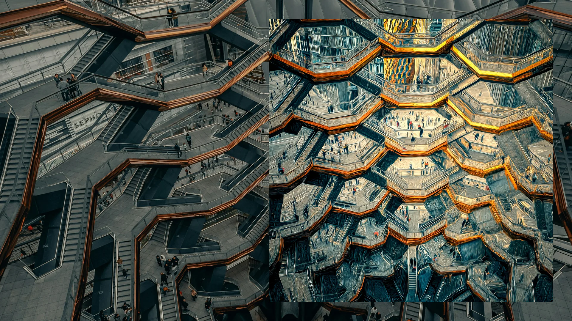
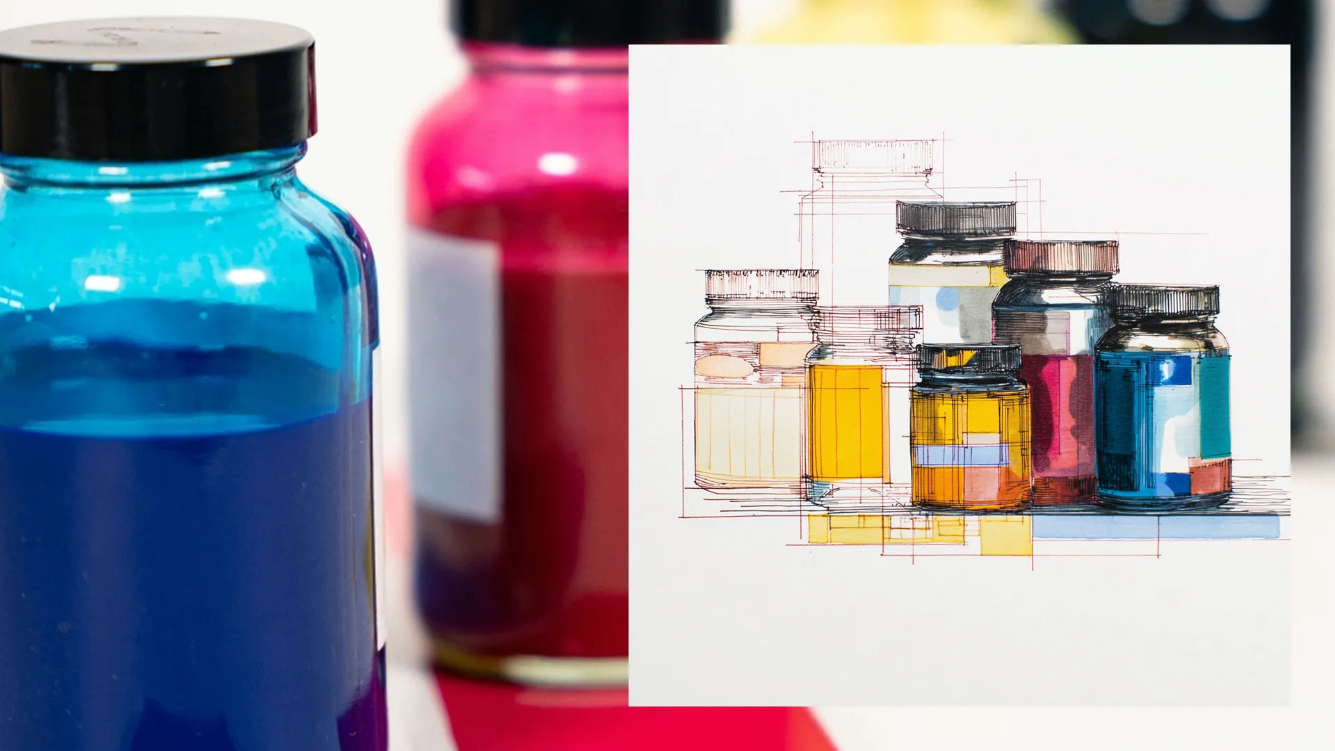
The inherited photography style was simply monochrome. At first, we explored using gradient maps in secondary colours that, whilst rich, also tended to be quite dark (although it contrasted well with the vibrant yellow). Later, we experimented with an “owned colour” approach, tinting photography to create instant brand recognition. Honestly, yellow proved harder to pull off than green or pink — it works in small doses but overwhelms at scale. More recently, I’ve been using AI image generation to create artistic interpretations of stock imagery, adding personality and distinctiveness to content that would otherwise feel generic. There’s an irony in using AI to make things feel more human, but some of the results speak for themselves.