The product with no UI

Iteration and user testing
Designing transactional emails that explain complex financial adjustments

When suppliers get paid early on invoices that are still open for amendments at the buyer end, things get complicated. Cancellations, disputes, and corrections can happen after money has already moved. The challenge: explain these reconciliations clearly to suppliers without building a portal—purely through email. This case study documents the iterative process of designing those communications, from spreadsheet sketches through user testing to shipped templates.

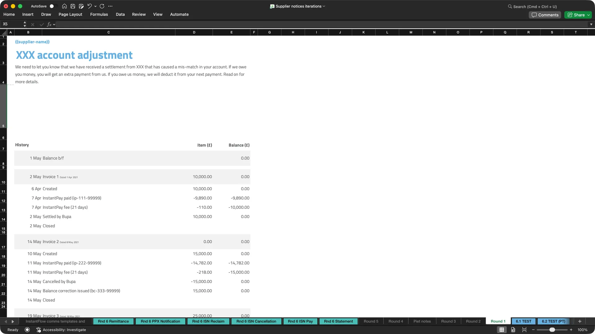
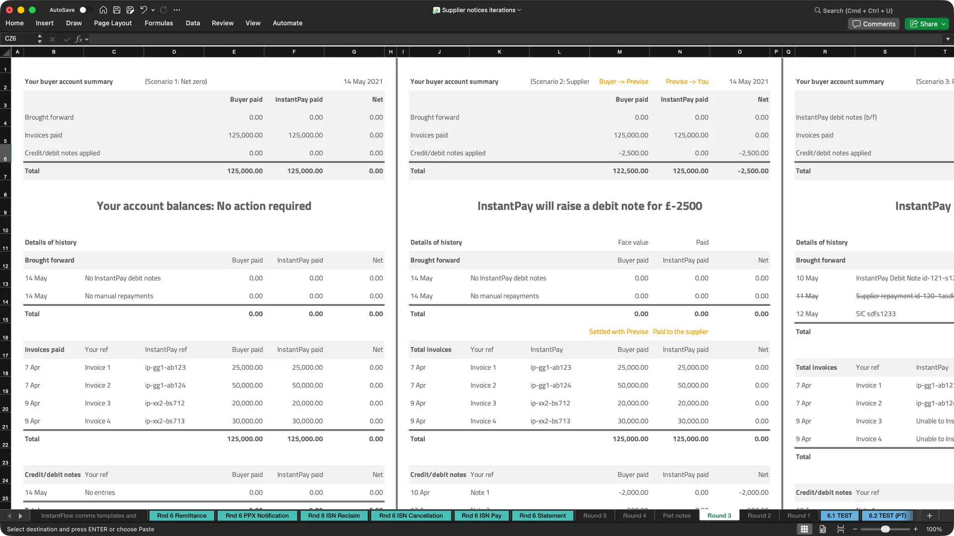
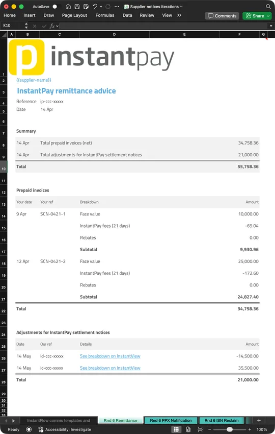
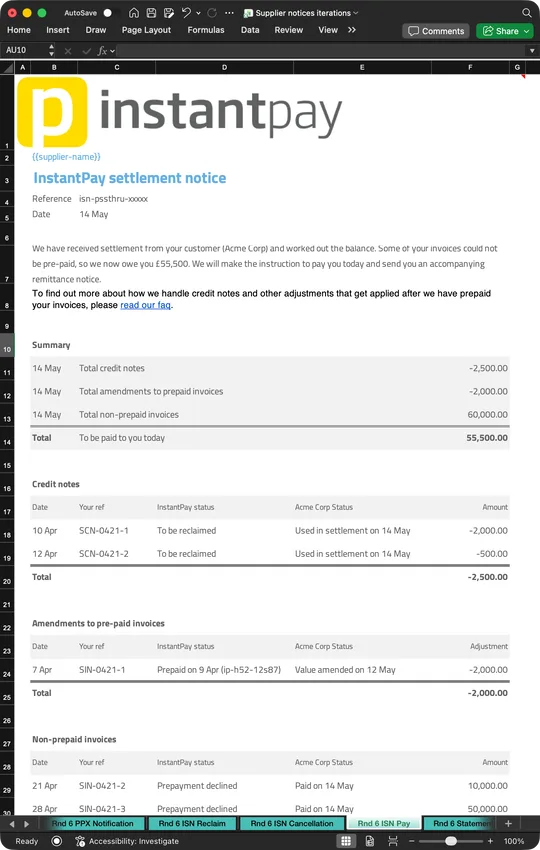
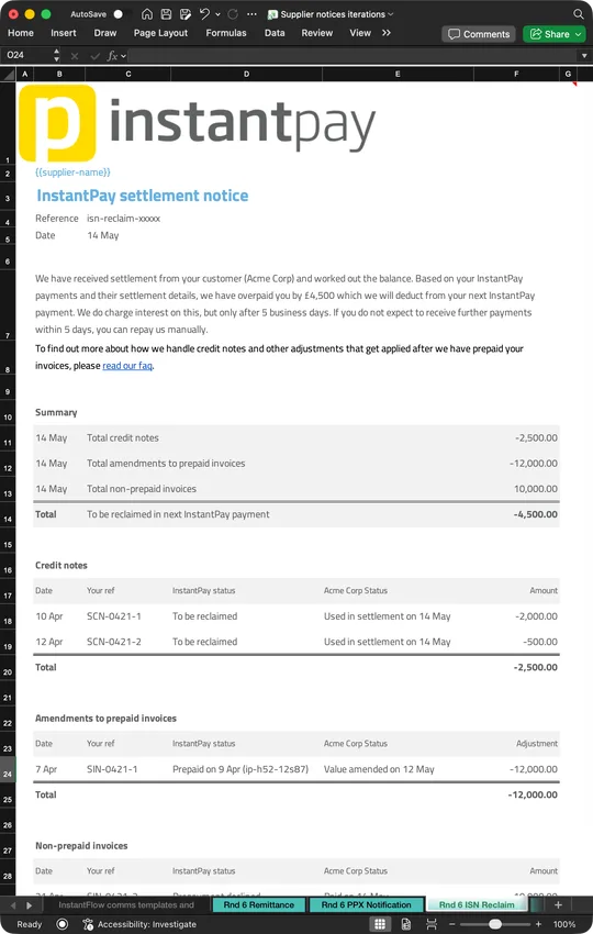
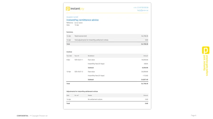
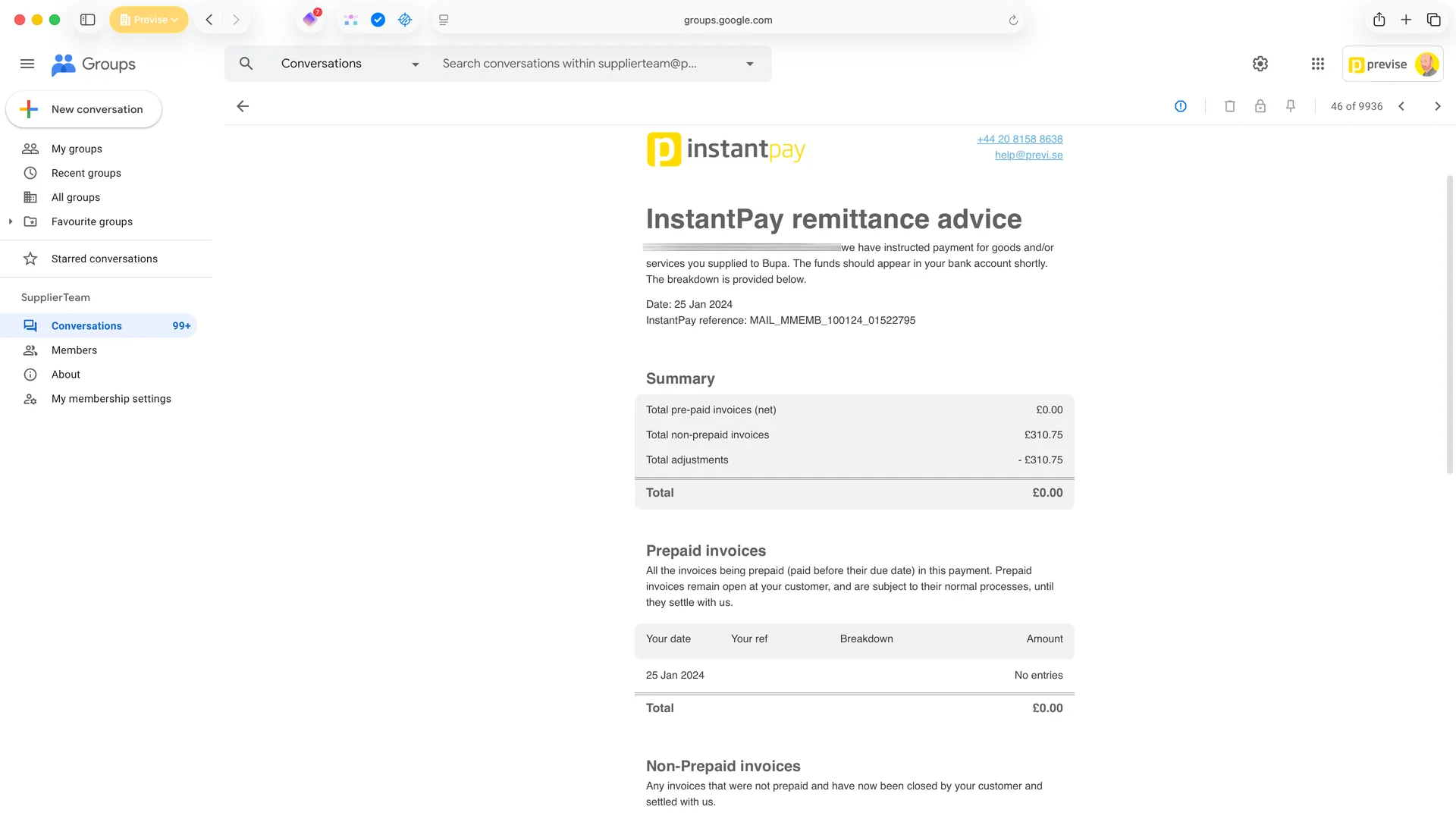
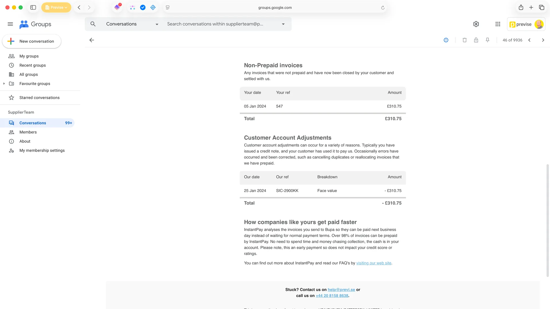
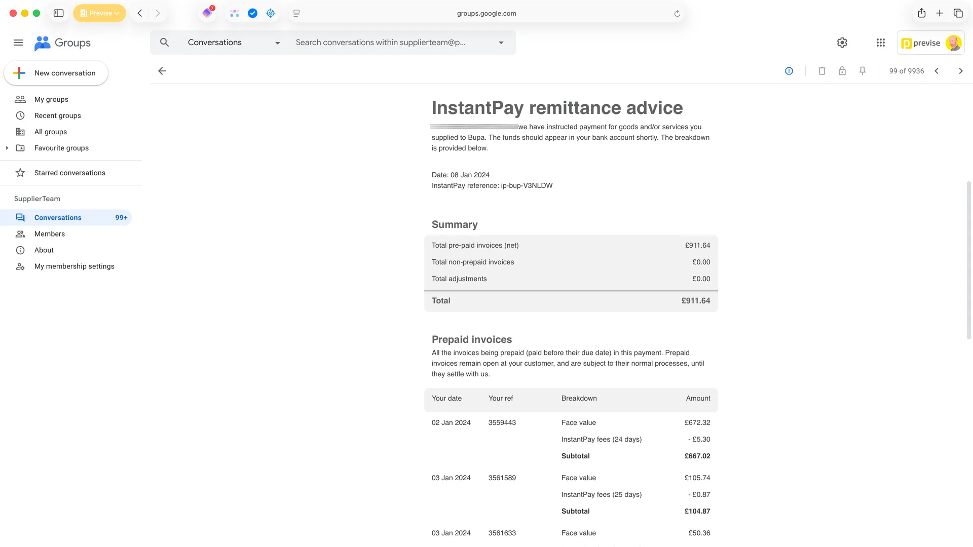
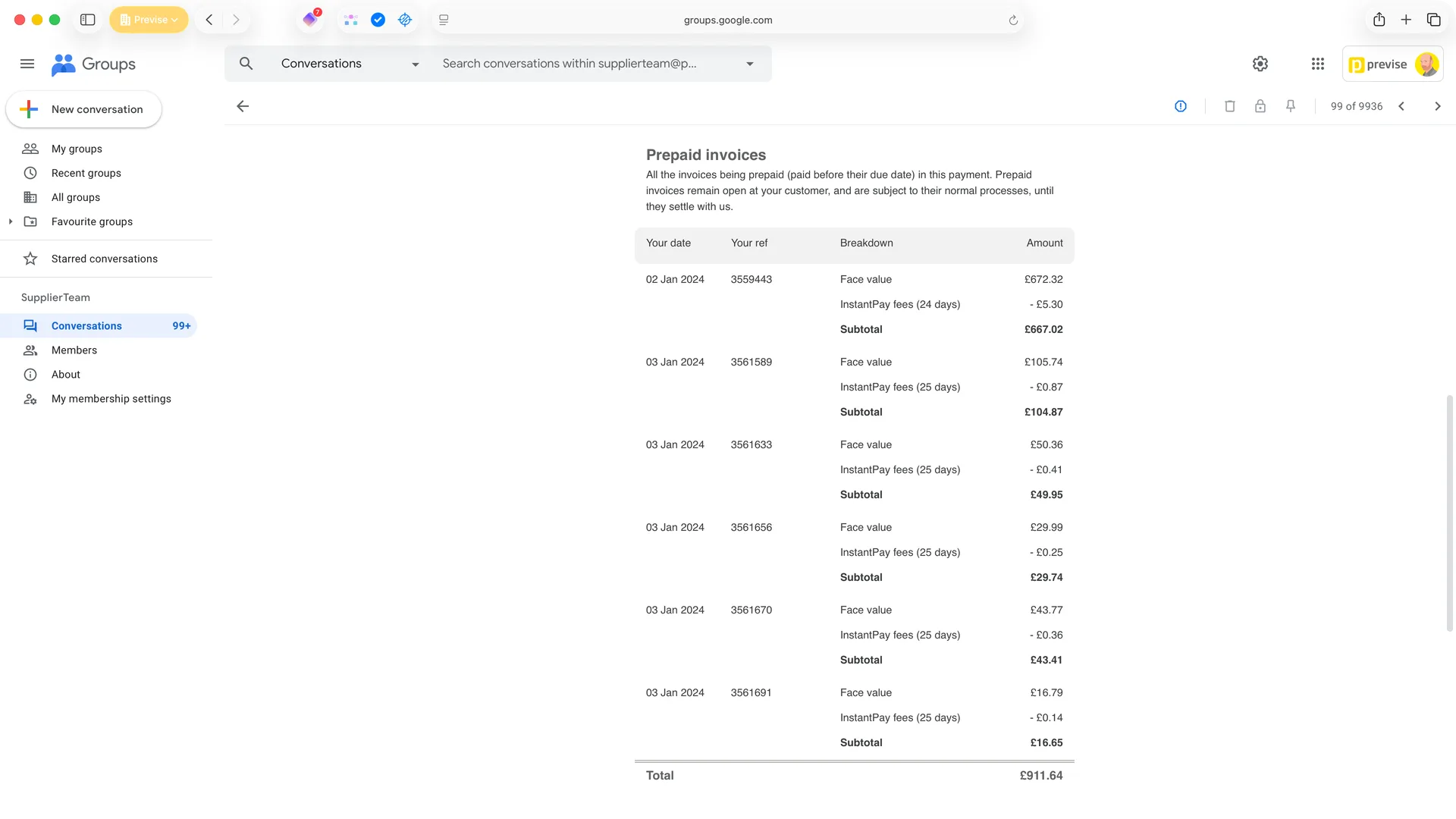
From spreadsheets to inboxes

With no portal to fall back on, every communication had to stand alone. We needed to explain account adjustments, settlement notices, and payment breakdowns in a way that made sense on first read. The iteration happened in spreadsheets—not design tools—so the numbers stayed credible throughout. User testing with friendly SMEs validated the approach and surfaced a critical terminology insight that shaped the final product.

1

Sketching in spreadsheets, not design tools

When you’re designing financial communications, wrong numbers create disproportionate dissonance—especially for accounting people. We iterated directly in Google Sheets, working through scenarios side-by-side with my boss, the Head of Product. The numbers were always real, always balanced. This meant stakeholders could focus on whether the communication made sense rather than getting distracted by placeholder figures. Multiple rounds refined both structure and content before anything touched a design tool.

2

Testing comprehension, not clicks

User testing wasn’t about interactive prototypes—it was about comprehension. We walked SME suppliers through scenarios: “If this landed in your inbox, what would it mean to you?” The spreadsheet mockups were accurate enough to test whether the structure worked. Across three rounds of testing, the layout held up well. But something else emerged that we hadn’t anticipated.

3

The terminology that unlocked understanding

Two separate test participants, completely independently, suggested “prepayment” to describe what was happening. The term clicked immediately—not just clearer, but technically accurate. Unlike other early payment systems that close invoices to amendments, ours kept them open. That’s a prepayment, not an early payment. Adopting this language removed the biggest comprehension barrier. Sometimes the most important design decision is a word.

4

Shipped: responsive emails I built myself

The final templates handled multiple scenarios—remittance advice, settlement notices, account adjustments—with responsive layouts that stacked cleanly on mobile while keeping tables legible. AI-driven risk analysis determined which communications to trigger and when. I built the production templates in Stripo and handed off working code to engineering for integration. These aren’t mockups—they’re the actual emails that went to thousands of suppliers.

This project reinforced something I’ve found repeatedly in fintech: credibility comes from sweating the details users actually care about. Finance people spot wrong numbers instantly. And the language you use matters—”prepayment” wasn’t just clearer, it was technically accurate. Sometimes the biggest design wins are semantic.

How we work

Fixed-scope projects for specific problems such as a UX audit, brand refresh, or product sprint.

Fractional engagement for ongoing senior design thinking without full-time commitment and costs.

We diagnose what's broken, deliver working solutions, and can mentor junior team members.

Take the first step today