McNair Snowboarding

Pro bono capability demonstration (Preview)
Letting the mountains do the talking

Radical website update for a professional snowboarding instructor with 25 years of worldwide experience. The previous site buried stunning mountain photography behind dated layouts and required editing raw HTML to update course information. The new design uses translucent layered panels that let Neil’s extraordinary images take centre stage, while a custom post type architecture means courses, locations and styles all connect automatically – write once, display everywhere.

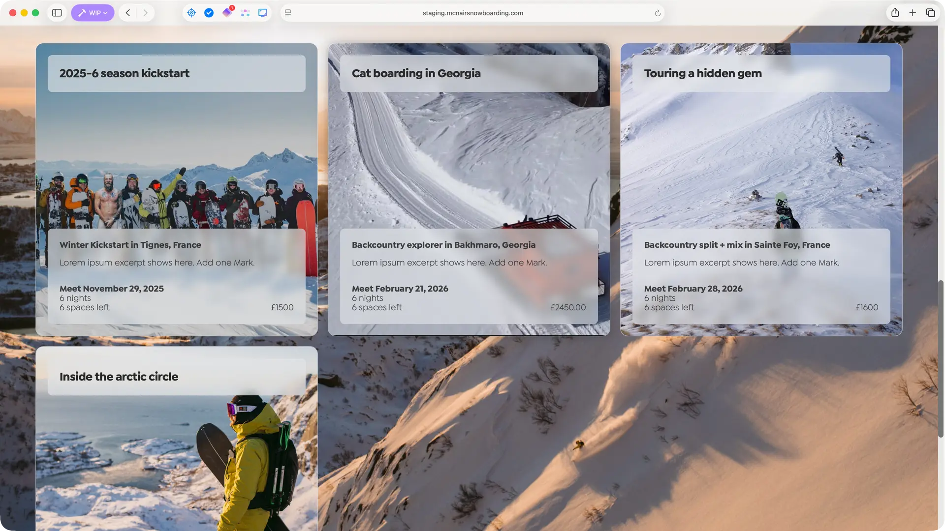
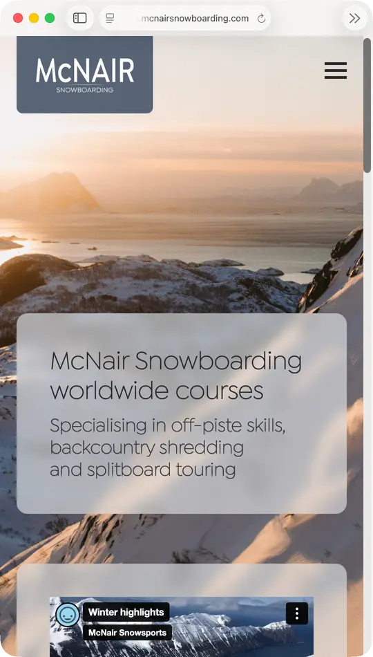
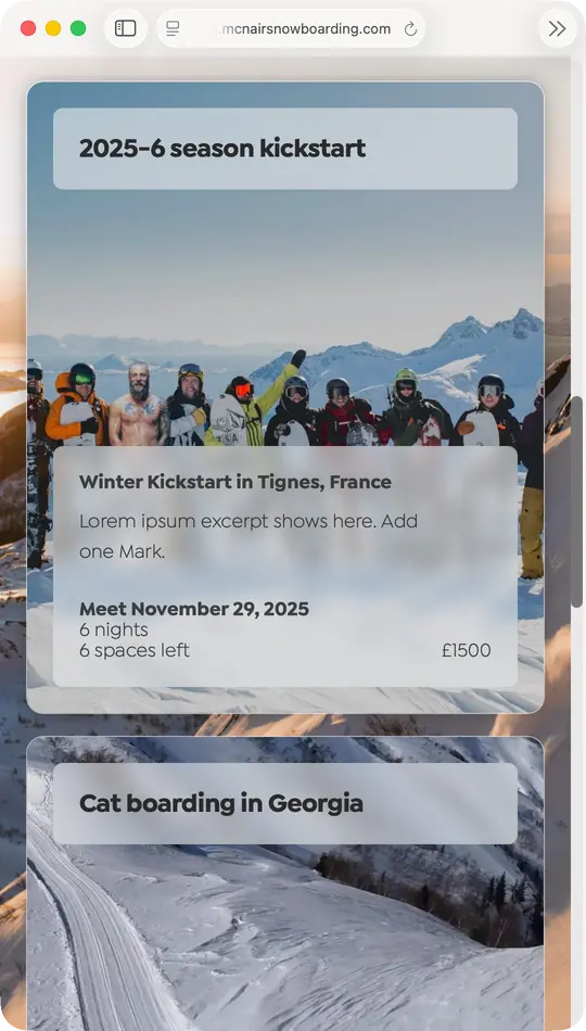
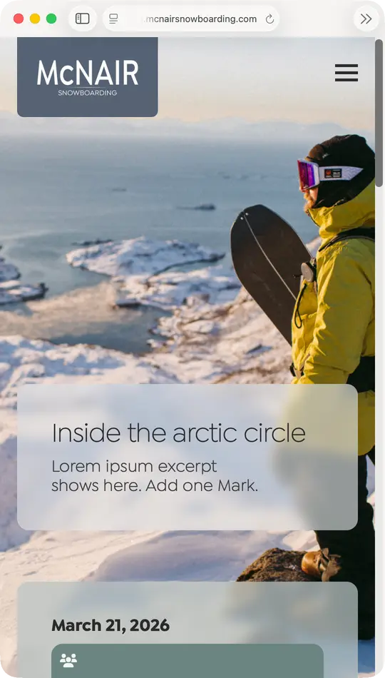
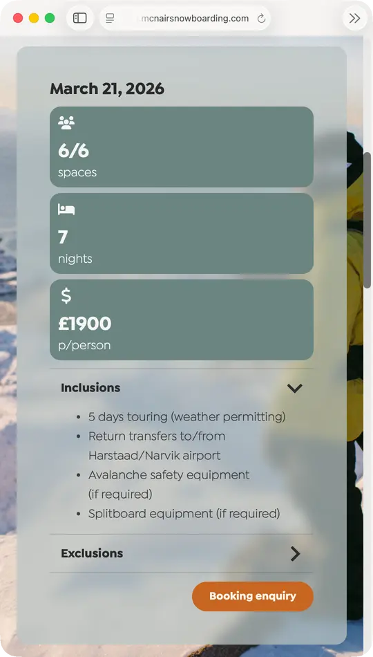
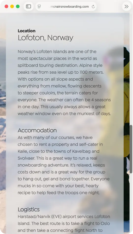
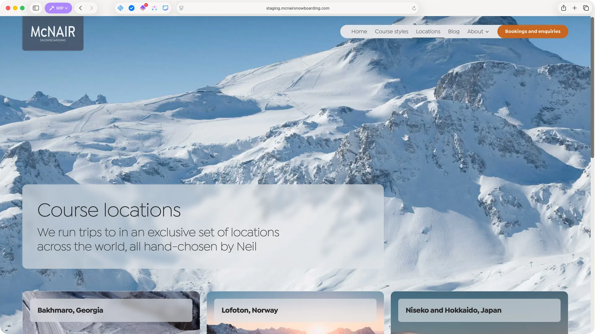
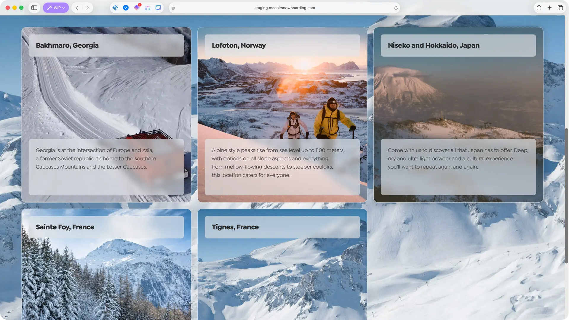
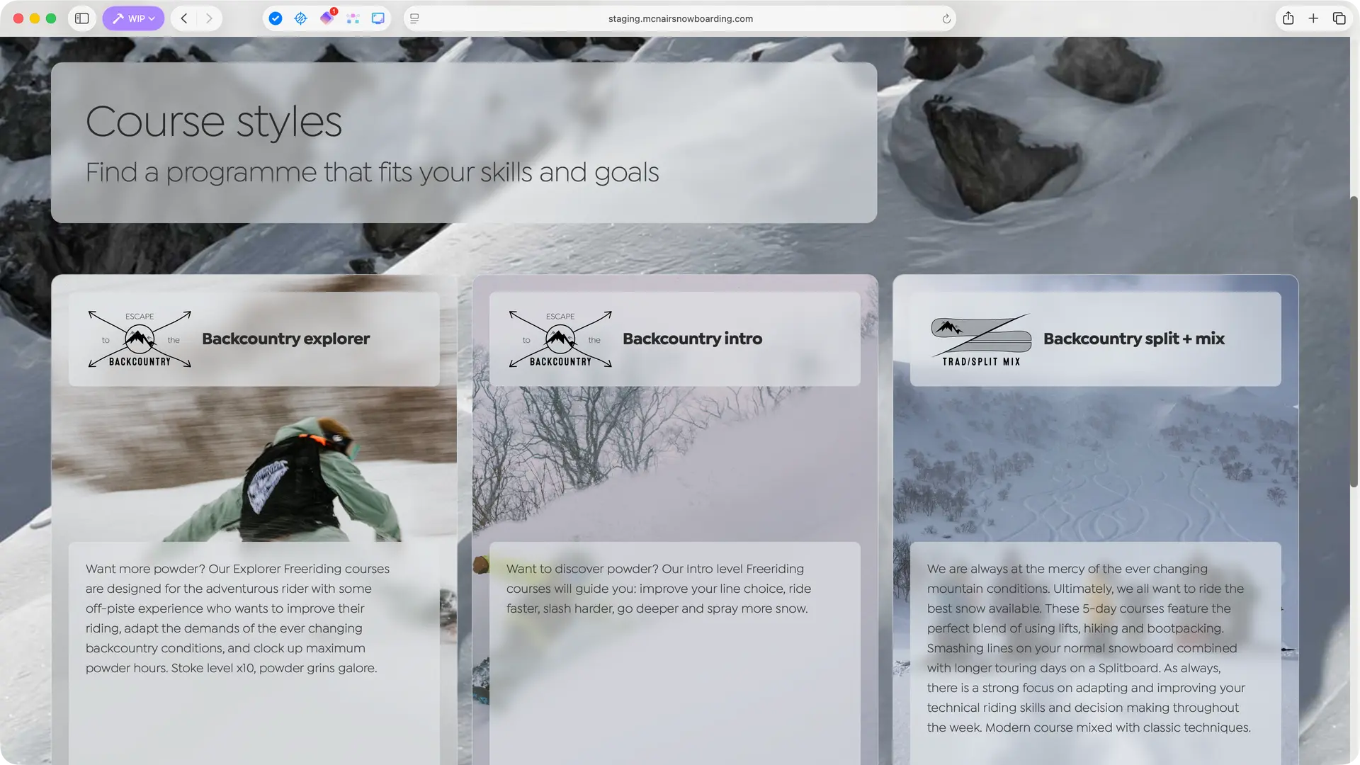
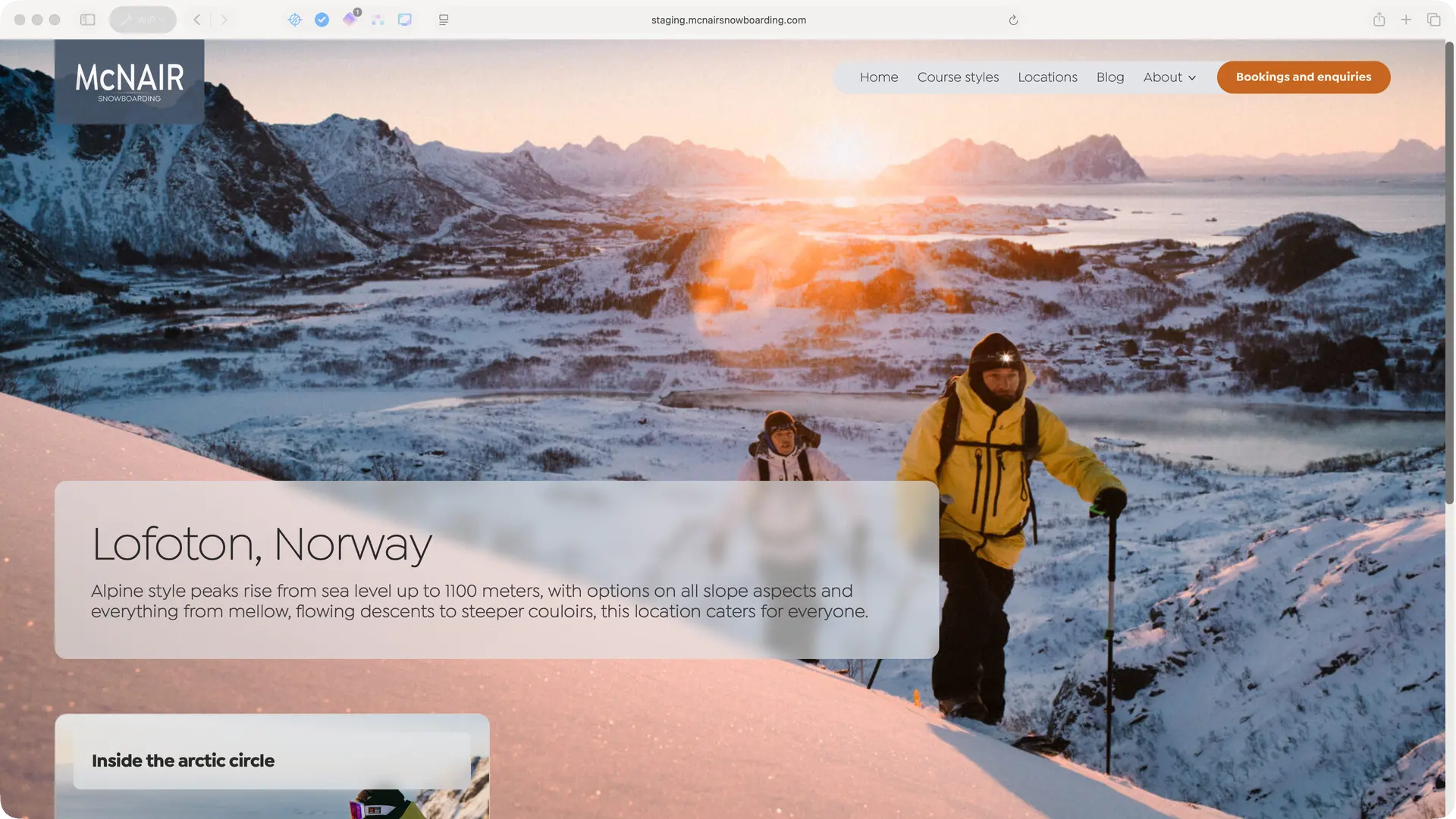
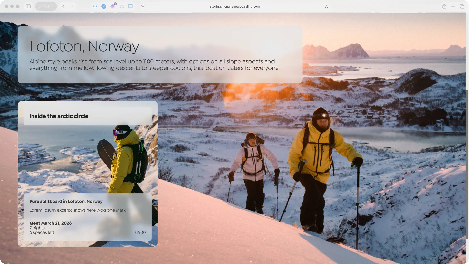
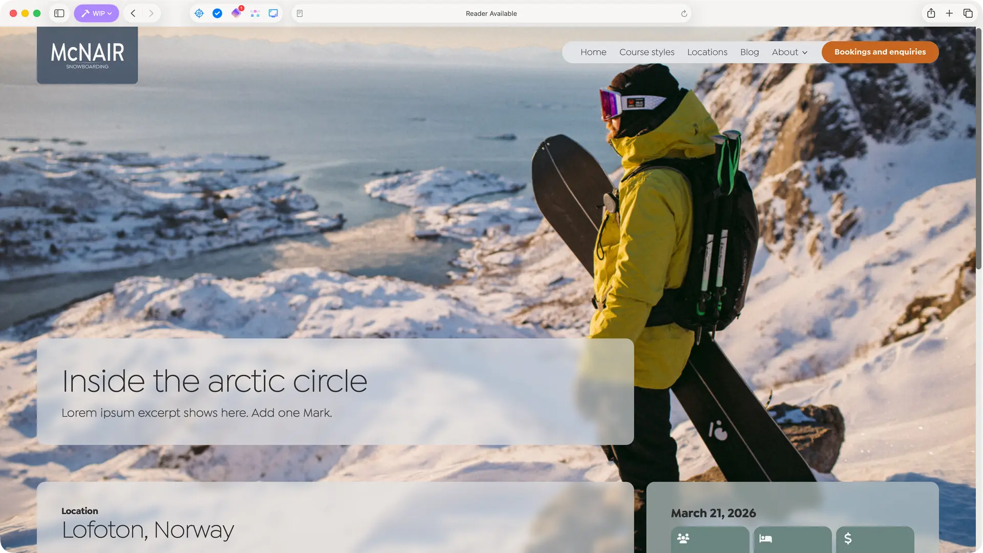
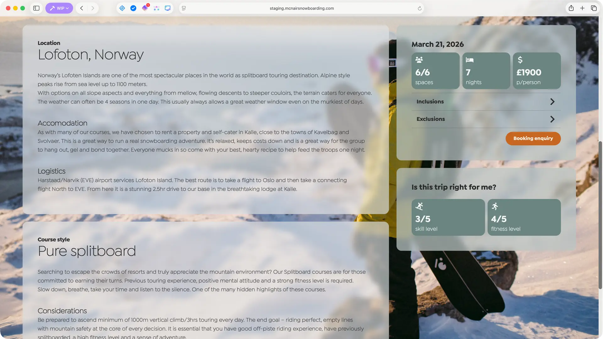
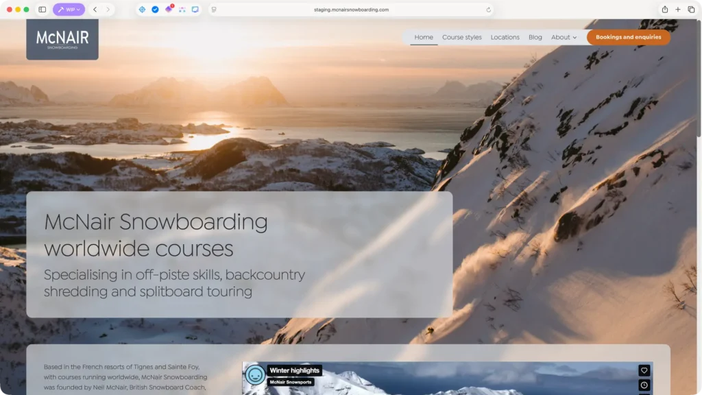
Photography-first design

Neil McNair has spent 25 years running snowboarding courses in some of the world’s most spectacular locations. The previous website had access to this incredible photography but buried it behind boxed layouts and dense text blocks. The redesign strips everything back, using translucent frosted panels that float over full-bleed imagery – letting the mountains, the snow and the adventure sell the experience.

1

Layered panels over full-bleed photography

The old homepage placed text in opaque boxes that competed with the background imagery. The new approach inverts this entirely – photographs extend edge-to-edge while content sits in translucent frosted panels floating over the landscape.

Typography is confident and minimal, trusting the imagery to do the emotional heavy lifting while text provides just enough information to orient visitors.

2

Course cards that showcase locations and style of excursion

The layered panel system adapts cleanly to mobile. Course cards retain their photographic impact at smaller sizes, with the information hierarchy – destination, style, dates, price – remaining scannable.

The frosted panel treatment translates directly to touch screens, keeping tap targets generous and content readable without pinching and zooming.

3

Consistent system across page types

The translucent panel approach extends throughout – location index pages, course style pages, and individual course pages all use the same visual language.

Location pages showcase the destination. Course pages combine location and style information into a complete picture of what participants can expect. One system, multiple contexts.

Editorial simplicity

A beautiful front-end means nothing if the site owner can’t maintain it. Neil runs courses across multiple continents – he needs to add new trips, update availability and adjust details without calling a developer. The previous site required editing raw HTML embedded in form fields, with course information duplicated across multiple pages. The new architecture uses three interconnected content types that eliminate duplication and make updates intuitive.

1

The old way: HTML in form fields

The previous site stored course details as raw HTML inside form field configurations. Adding a new course meant editing markup like <strong>21st - 28th February</strong><br />Bakhmaro, Georgia – buried several clicks deep in a form builder.

Each course style page had its own embedded form with hardcoded course data. No central management, no overview, significant risk of breaking things.

2

Three content types, one system

The new site separates content into three custom post types: Courses, Locations and Course Styles. Each has fields appropriate to what it represents.

A Course has dates, duration, price and difficulty ratings. A Location has destination details and logistics. A Course Style has programme descriptions and badge artwork. Creating a new course means filling in a simple form and selecting from existing locations and styles – no HTML, no duplication.

3

Automatic content composition

The real power emerges when these content types connect. A course page automatically pulls in the introduction and logistics from its linked location, plus the description from its linked style.

Neil writes the Lofoten description once; every Lofoten course displays it. He updates the splitboard programme details in one place; every splitboard course reflects the change. The relationships work both ways – editing a location shows which courses use it.

This project demonstrates what’s possible when design serves content rather than fighting it. Neil has decades of extraordinary photography from mountains around the world – the job was to get out of the way and let those images carry the experience, while building a content system robust enough that he can manage courses across multiple locations and styles without touching code or duplicating effort. The result is a site that feels as premium as the experience he’s selling.

How we work

Fixed-scope projects for specific problems such as a UX audit, brand refresh, or product sprint.

Fractional engagement for ongoing senior design thinking without full-time commitment and costs.

We diagnose what's broken, deliver working solutions, and can mentor junior team members.

Take the first step today