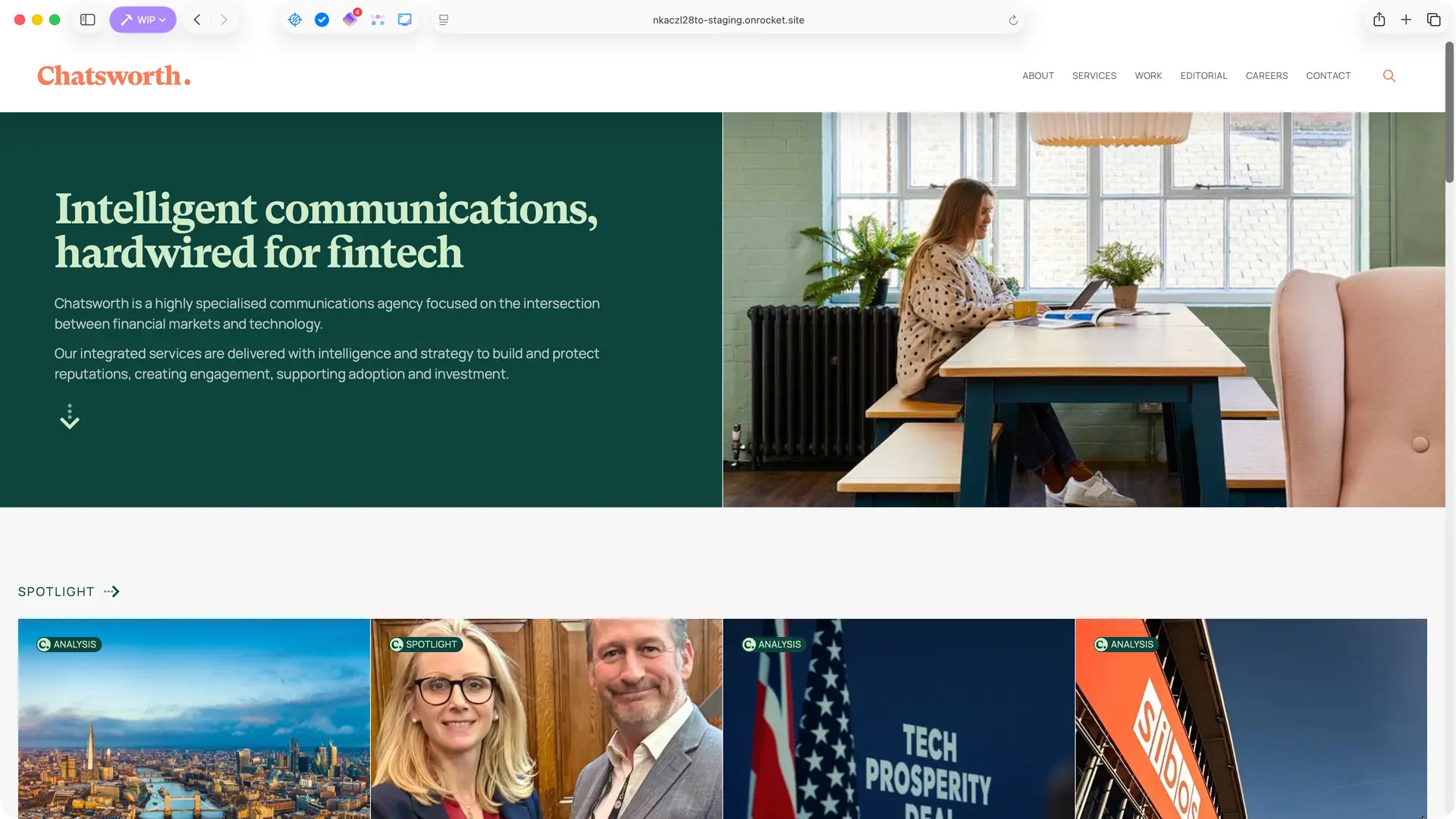
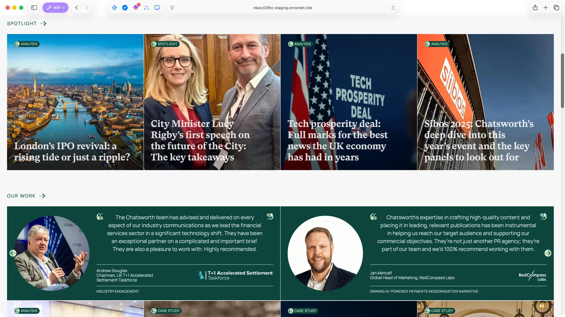
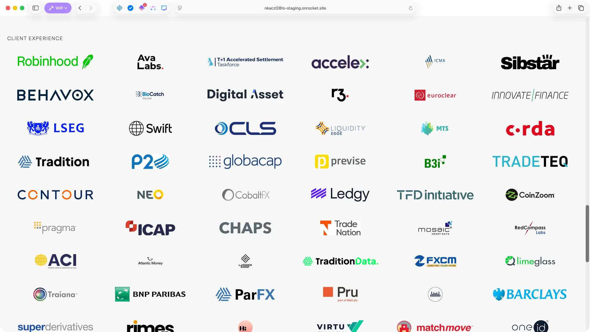
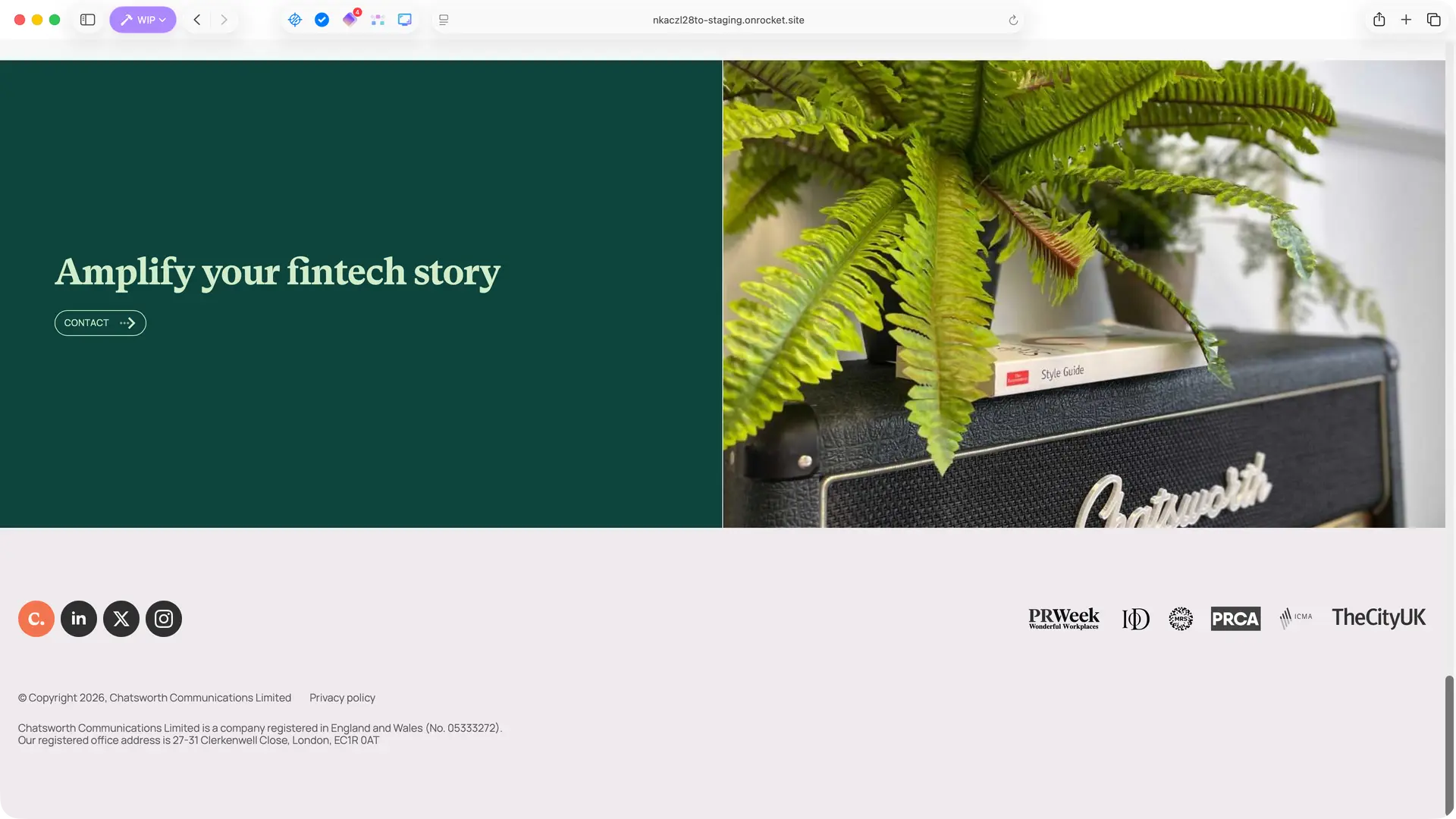
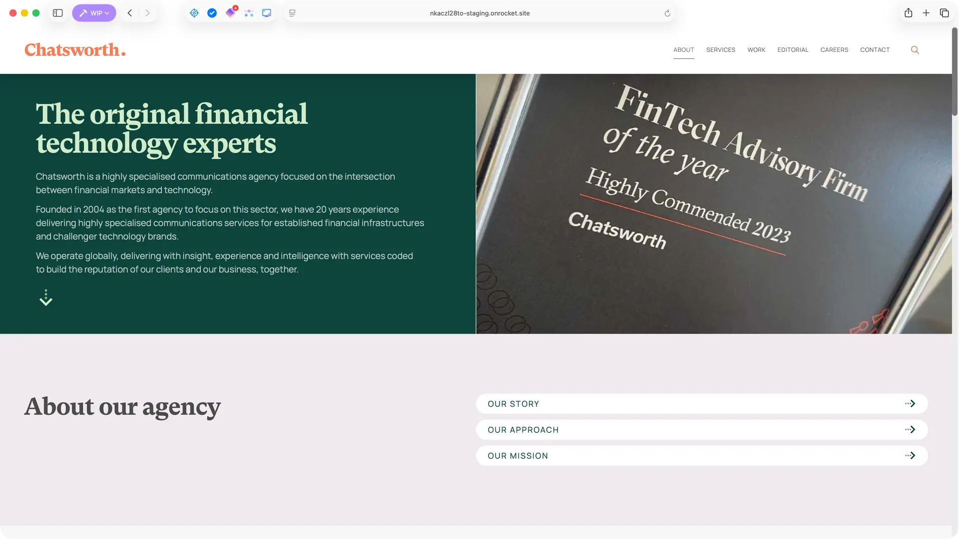
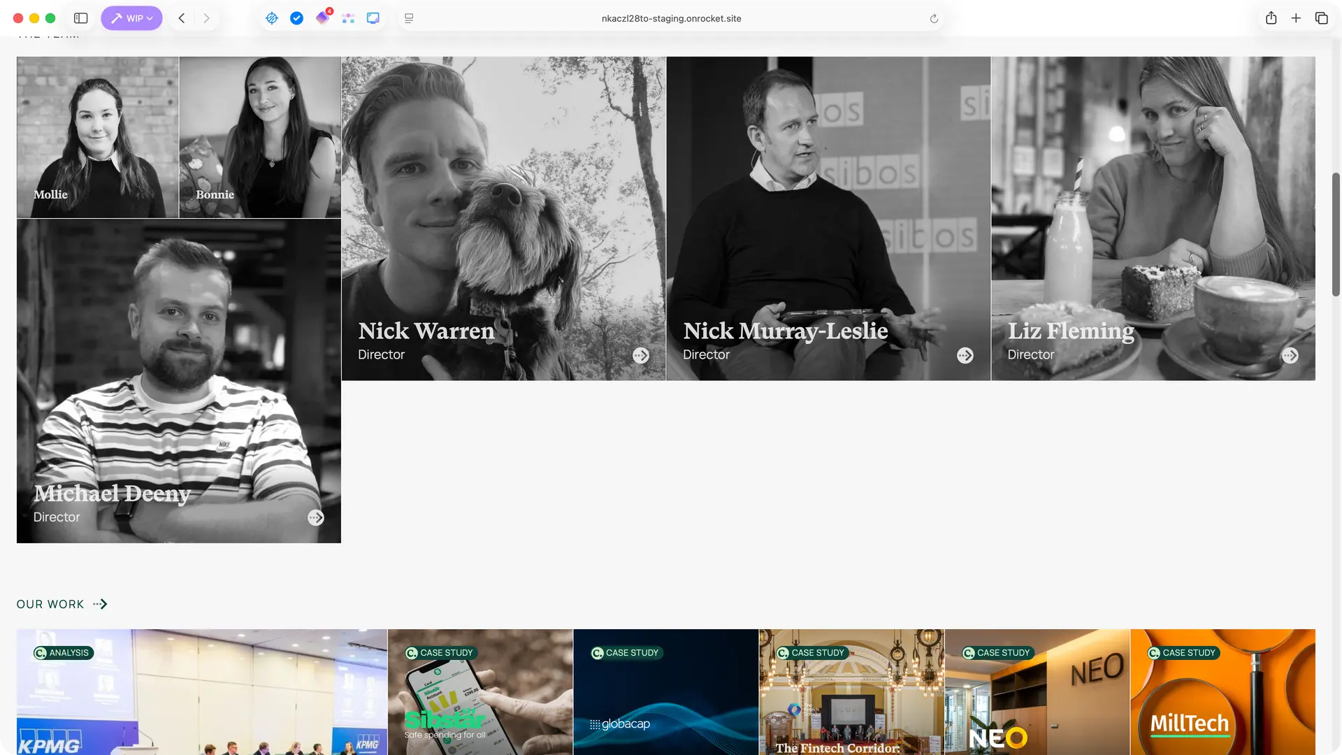
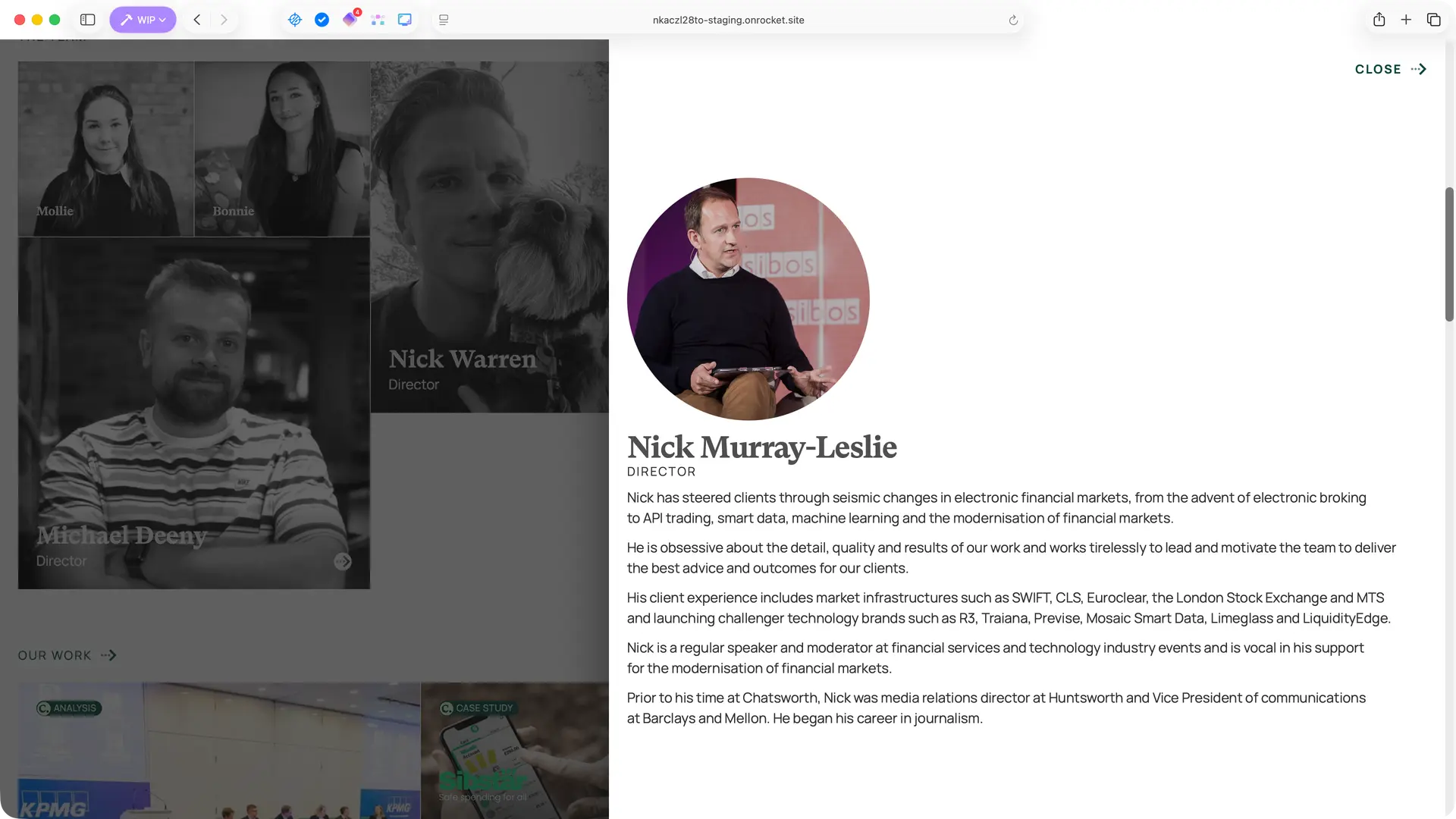
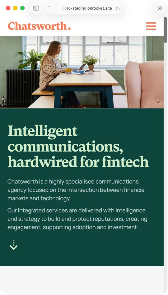
PR Website Redesign and Build

Client project
Chatsworth Communications

Complete website rebuild for the UK’s original fintech PR agency. The previous site had become a liability — slow, outdated, and impossible to maintain. We designed and built a flexible content system that lets the team dynamically prioritise their work and insights for different pitch contexts, without developer involvement. Clean, confident presentation that reflects two decades of sector expertise, with thoughtful details like interactive team profiles and a responsive editorial system.

The rebuild

Chatsworth had outgrown their previous site years before we started. Built on an aging theme with unmaintainable plugins, it had become genuinely painful to use — admin pages took minutes to load. We rebuilt everything in WordPress with Breakdance, focusing on a content architecture that would serve their business development needs: the ability to quickly surface relevant work and insights when pitching to prospects.

1

Homepage with dynamic content prioritisation

The homepage needed to showcase expertise, client logos, team, and editorial content — but with flexibility. Editors can reorder content blocks and featured posts through drag-and-drop interfaces, letting them put relevant work front-and-centre for specific pitches.

No custom post types, just smart use of taxonomies and conditional fields that keep things simple to maintain.

2

Editorial templates for insights and news

Chatsworth publishes regularly — market commentary, client news, fintech insights. The editorial templates needed to feel authoritative without being heavy, with clear typography and good use of imagery.

Taxonomy-driven enrichment fields appear contextually, so a post tagged as client news gets different treatment to a thought leadership piece, all managed through a single familiar interface.

3

Team profiles with interactive popovers

The about page introduces the team through a clean grid layout. Rather than navigating to separate bio pages, clicking a team member reveals an inline popover with their background and contact details.

A small interaction detail, but one that keeps visitors oriented while still giving each person proper presence.

4

Responsive experience across devices

A PR agency’s site gets viewed on phones during commutes, on tablets in meetings, on desktops during research. The responsive implementation maintains hierarchy and readability throughout, with the mobile navigation and content blocks adapting cleanly.

The same content prioritisation system works regardless of viewport — what’s featured stays featured.

Chatsworth remains an ongoing client. Since the site launched, we’ve added interactive profile popovers, refined the editorial templates, and continued evolving the design system. The site now loads in seconds rather than minutes, and the team can reorganise their homepage in the time it used to take to open a single admin page.

How we work

Fixed-scope projects for specific problems such as a UX audit, brand refresh, or product sprint.

Fractional engagement for ongoing senior design thinking without full-time commitment and costs.

We diagnose what's broken, deliver working solutions, and can mentor junior team members.

Take the first step today